Showing posts with label process and production. Show all posts

Wednesday, 13 April 2016

Selfie Graphic & Narcissism infographic: Info-graphic Video inspired from After Effect workshop


This is one of my final piece work that I had design in response the my idea which was Selfie graphic and Narcissism for the Conversation Brief but it was also a response to Motion city workshop. In the beginning I had just designed a long big info-graphic poster with Selfie facts following Narcissism facts and the reasons why it they both can relate. It was made to question if Selfie was contributing to narcissism. I was happy with my final piece but then in the following week, I had a After effect workshop which taught us how to use a bit of the camera. This workshop was called 'Motion City'. I really loved what the camera could do to your animation work and wanted to try some more of it myself. That is when I decided to make an info-graphic animation of my poster. I used many of the same illustrations I already produced on Illustrator for my poster but also made new ones. I used the camera zoom on the part where the instagrams likes comes in and rotates around. I thought it was a cooler opening for the second composition rather than it just being someone already using the phone. The link below is the full final pieces for the conversation brief. 

https://www.behance.net/gallery/36658153/Selfie-Graphic-Narcissism

Friday, 8 April 2016

Improving England's Weather Infographic: Audio and wind.


I really enjoyed making my info-graphic for After effect workshop and that made me want to work on the animation more as I can go into more depth with the clip and try and improve it. Although I was happy with my outcome, there were things I noticed that I should of done on the video. This was proof read,  more of weather animation and lastly Audio. So these were the three things I focused on for my improved info-graphic video.


I wanted wind in the end to join the rain as I feel like rain just look plain. England's weather is bipolar so that is why I had show sunshine a high degree and at night, rain with a low degree temperature. I needed a solid for the wind effect which is called Fractal Noise. I dragged the Fractal Noise to the solid which made it look as if it was filled with white lines in a black background. After editing the brightness and contrast, I got a closer look to a wind but it still did not move and it looked unrealistic. That is when I played with the Evolution which is the key to animating this effect. I was filled with glee knowing that I had a wind even though it was going just straight and I knew needed to work on that. In order to have the wind more realistic looking, I needed an effect called Brezier Wrap. This caused the plain wind to go all over the place as most winds should do. After I was satisfied with the grammar and the new weather animation, I moved on to the ending of the clip that I knew I needed as I had to credit the Audio to the original artist. I used a smooth modern Jazz music from an upcoming artist. I found my info-graphic video looking ten times better than the original and I am glad I played more with it. 

Cinema 4-D: Playing around my Logo from previous lesson


Logo improvement 


I had done a Logo on Cinema 4-D for my first lesson on this programme, we was shown how we can use text and type from Illustrator to Cinema 4-D. I gave myself pat on the back for being able to go through such a difficult programme and gaining an outcome in the end. I wanted to get to get know Cinema 4-D more due to my third lesson sparking my interest on the materials that can have different textures and reflections. This the outcome of my adding the reflection legacy to the type and floor.   

Thursday, 7 April 2016

After Effect: 30 Seconds Showreel


Adam Gault studio

Project: Montage 2011

The showreel was made in 2011, this showreel created a lot of stir, a lot of attention. He not only cut his work but he also edited the music, it shows how good the designer is with music and with motion. It is the edit in the clip that shows the designers skills. You take your original material and you cut it to pieces so it can last longer. One of the things that is really significant is in term of the audio is that he was cutting it to go with the way his work was edited, it was like a beat. You have to consider your music because it is the most important part of your work as it backs it up.


Our work is similar in the style edited it in. Each of the object complies the full screen.  We are going to edit the clip really quick and after edit anything that we left out as in putting music or enhancing it any other way. It means we will have intermediate response to it. 

The idea of a convention graphic is a way to show my portfolio. One of the things that is particular convincing it is the soundtrack I will be using, it shows the impact of the showreel, any type of music I got, I can use it to my advance. Part of is showing my strength, I want to show my work, the technique I am more confident on, It shows future employers that I am capable of using motion graphic. 

It was really important that I show something in the clip about myself as it will show something about me, about what I really want to do. When I created this work I was talking about my future, as in an inclusion of work to do with a particular subject, then probably the connection they will get from that is the work involving that subject. So I asked myself what I had enjoyed the most during this whole year involving After Effect. It was the first lesson of motion go, the maths teacher in the classroom and the info-graphic on England's weather. Those are the two clips I tried to show more of. 

We started working on audio first on After effect because audio is really important because it will make the convention better. Then I created the intro and ending composition myself as it looks better to introduce all your work and also add in information in the end, such as the name of the music I used.

So On to creating a title as an analogue for our projects. At the beginning when the reel will open, I wanted something that will last to 3 or 5 seconds with my name, showreel or/Production Reel 2016 and the University I attend. For the ending composition, it will be C Copyright symbol, crediting the Audio, link to the video and maybe email. It gives the work a gravity and it gives the whole thing feel final.


I rendered it on quicktime as it will give me an option to edit the quality. So it is optional whose ever computer it is on to change it. So this is an advantage if I am taking it to show people. 

This is my show reel, showing every single animation video I had made on After Effect workshop. I think having all the videos combined together shows how much I have progressed. 

Sunday, 3 April 2016

My own rules in 3-D Type


I thought why should I should I just gif out my Rice 3-D type when I could do more than just one and that is when I came up with the idea of mixing my 1st experiment 'Rice' with the unique 'E' with my 'Nice' one. I wanted to communicate "Rice is nice", so I had to first create another 3-D type with the word 'Is'. After creating this word, I had uploaded the photos on photoshop and applied the same photo quality effect as I did for the previous ones. Then I used my already made gif for 'Nice', and just imported the new images for the 3-D type 'Is' and 'Rice'. I enjoyed the process of creating these gifs and found that my gif looks better when it says 'Rice is nice' instead of just 'Nice'.


Analogue Communique 3-D Lesson 3


Continuing on from my previous lesson where I experimented with with rice on red card paper. I liked my second experiment where I had added two meaning as in the word I am communicating, 'Rice' and 'Nice', because rice is nice. I had decided to play around with this experiment more and to see if maybe it could be improved in a way that it can stand out. So I created a stop motion gif clip of the design process of my 3-D type. I had used photoshop timeline 'Create Frame Animation', where I placed all the images from my phone. I used my phone to take the photos of each different movement or thing I had done whilst creating the type. Before I started to create my gif, I edited the all the photos quality with brightness and contrast effect on photoshop, I prefer the contract all the way to 100 because the red turns bright.


Thursday, 31 March 2016

Analogue Communique 3-D Lesson 2


Following up from my previous lesson where I was experimenting with rice and getting used to the texture. I managed to create simple words which I was happy about because I could create a large type and there would be no lack of quantity in the material, so I was content with the choice of material and I felt that there was no need to change materials. As I already experimented on my previous lesson, this lesson I wanted to purely experiment with style and form of type that I could create.

1.


2.


3.

I am really fond of the red card paper in the background because it distinguished more the rice texture as appose to it being on a plain brown wood or white people which was the typical things laying around but before I came to my lesson, bought the card paper in a store. It is only right to go for a different approach with rice because it being placed on a white background will only make it difficult to make out the type. 

Initially I wanted to just go with the plain word ' Rice' as it made sense since it is the material I am using and we was told we could use any word to communicate and in that case mine was rice. As you can see from the 1st experiment. I like the type style i created, especially the 'E', which is unique.

I moved on to a different style and possibly a different word. I was told that 'Rice', was just too plain and so I decided to combine the word 'Rice' with 'Nice. The second and third experiment outcome, you can see that the beginning letter is could be an 'R' or an 'N'. It was my goal to have both. My thoughts during this was just 'Rice is nice'. For the third experiment I tried to create the type outvert instead of the invert style I had done for my previous two experiments. 

I like all my experiments, I had not found anything difficult when it came to creating the form because it was easy due to the material which I am still thankful for. I am hoping to further develop the second experiment because I really liked this 3-D type and wish to see if I could somehow make it more effective and stand out. 


Thursday, 24 March 2016

After effect: Infographic


Before this lesson we were told that we were going to need to collect information such as statistics for the information clip we was going to produce. So I gathered some information about the typical England's weather on regular days. Keep in mind that on the day of the class, I had to unfortunately miss it as I was of sick, so I did not hear the news that we was suppose to make a an animation upon a  fairy tale story. So my info-graphic video was already made before I heard the news which was weeks later but I was told by my teacher for After effect Sarah that it was perfectly find If I had done my info-graphic based on something other than a fairy tale story.


My info-graphic video is 10 seconds short which is usually the recommended time we are told to use in After effect. I produced the art work for the animation on Illustrator which took an hour and an extra hour to find a texture for the clouds I want to use on my cloud layer. I had used the normal key frame transform tools to bring my layers to life. Whilst I was creating my video, I could plainly see how much I developed in After effect, after two years of this workshop. It paid of because I was really pleased with my animation. I never created something good with just simple regular tools being used in After Effect. I can see the changes.

England's Weather Infographic from Yanda De Vasco on Vimeo.

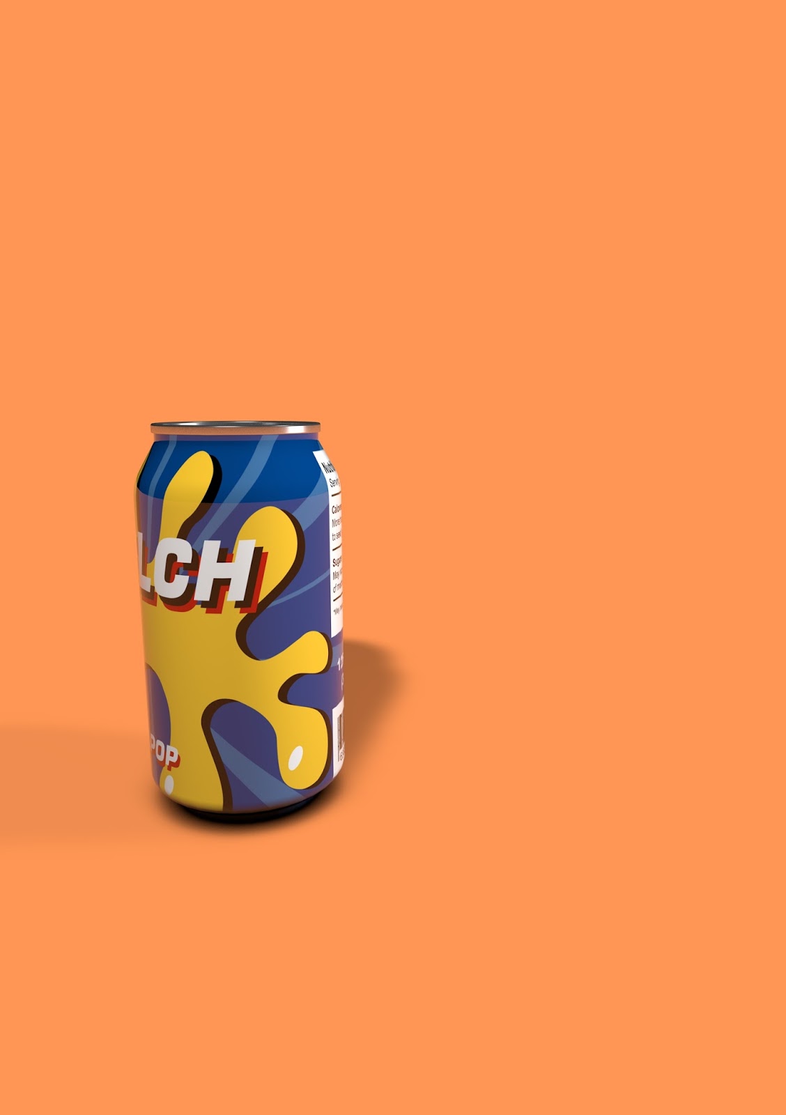
Cinema 4D Lesson 3: Cinema 4d as a Design Tool - Prototyping


 Bottle
Can

In this lesson we will learn how to use Cinema 4d as a Design Tool for prototyping. This outcome from this session will be a series of a design prototypes of using cinema4d. This is at looking at ways to express ideas, without wasting time with printing something when you can show a prototype for the idea. 


We started with the art work that was provided for us by Jay, my teacher. It was an Illustrator ai file, kept that way so we are able to to modify in the way it is needed, so it can be imported in Cinema 4-D. The most important things were that I needed to open up rulers from the view option, and move it to the centre and bottom of the of the can and bottle shape. Then reduce the art board size to fit the art shape. Lastly save the file as Illustrator 8 ai because Illustrator 8 works better on Cinema 4-D.


We continue to import the file and renaming each shape layer so it is organised in an orderly fashion which makes it easier to follow. We create Lathe Nurbs in each shape; rotating around the shape to create the form. We then move on to adding the background and adding a composition tag floor, and the material for the can and bottle. Now I was star struck by how realistic the bottle can come to life when you render up the work. I kept thinking to myself, how do we make it look realistic? On that day we got taught something that may have sparked my interest in Cinema 4-D more. It was the reflectance legacy we can add to the materials that we will soon drag up to the lathe. 

I am not used to this program, so it was fun getting to know something new. I was happy with my outcomes. I love how realistic an art work you produce in Illustrator can be made into this. I am ery curious on other things Cinema 4-D is capable of.  

Thursday, 3 March 2016

Cinema 4D Lesson 2: Particles

In this lesson we were shown how we can create particles on Cinema 4-D in order to have psychedelic patterns with dynamic shapes. I was unfortunately sick on this day and had not got the opportunity to learn how to use the subdivision tool with the twist tool to create the particles in such way. I seen many images of people's work on that day and it looked as if there was a balls going in through a an extruded shape that resembled the pattern that we see so much when it comes to 'hypnotise'. In the beginning I had tried to follow the steps of this process that my teacher provided online on unilearn, however it was so difficult and definitely different when you are not around in the class to get help. I am better learning when it comes visually. So after trying and failing this version, I had looked online to see if there was a tutorial that I could watch and I had found one called Cinema 4-D tutorial: Particles on youtube, the link is below. I chose this tutorial because looked like he was making his particles swarm through a certain direction which is one of the things that I needed to aim for.


I used the Simulate tools, went for particles and clicked Emitter, which made a swarm of little white small particles go everywhere but into a the right direction. I selected the emitter, and clicked MoGraph tool, Matrix and this came up with over 20 white small squares and what I did was combine it with my emitter, by going on the object section on the matrix and changing the object mode to object and also changing the object to emitte. We got a swarm of square particles going to the right at a medium speed.


I wanted the small squares to be circles so I added in the cloner and sphere effect on to my work which caused a big dark grey ball to appear on the centre and it looked like the small swarm was coming from there. On the second screen shot you can see the square is now a circle and I did this by pulling the sphere down to the cloner section which morphed them together. 

By this point, I was happy i was getting somewhere with my work, I had the same shape and it was moving but I needed more but unfortunately the tutorial was ended up going to different direction than what I needed to do. So I had to teach myself and see what I could do as I could not find one that was similar to the one taught in my class.


The first thing I needed to do was add colour to my particles. On the bottom part of Cinema 4-D, I selected create and colour mask which then appears with more options on the right side. I wanted a gold colour but not a matte texture more of a reflection texture which I had learned about in my previous Cinema 4-D lesson when we was taught how to create prototypes. So after making my colour mask, I just dragged it to the layer I wanted which was Sphere. 


Then after adding in my colour, I moved on to concentrate in the background. Initially I wanted to try and follow the steps my teacher showed us but found it difficult to make the extruded background with the distorted lines. I made the decision I may have to take a different path and so added in a physical sky which I found cool, maybe it is because I am a newbie when it comes to Cinema 4-D so anything can excite me but I really liked it and decided to keep it. The image below is my outcomes. 

 With clouds
Without clouds


Reference:
https://www.youtube.com/watch?v=2OdRYXiYiHc

Sunday, 21 February 2016

Analogue Communique 3-D Lesson 1

In the following lesson we continued to work around experimental type but this time experimenting with materials to create type using 3-D Forms. The objective of this lesson is to communicate our message using our choice of material as a 3D type installation. 3-D Type can come useful in the need for to capture the target viewers attention and gain a somewhat different response as in this time non 3-D type such as the type we see on the regular on social networks. Something different can be positive. Materials to create our 3-D type has to be unusual and it could be anything such as from food to recycle materials. I went for rice because I started to think about the possible things it could provide for me whilst I work with it. Other than it being effective when using it to create my 3-D type, it can also be beneficial when it comes to the amount I can have.

These are just the initial experiments I had done before starting to fully experiment with words.