I thought why should I should I just gif out my Rice 3-D type when I could do more than just one and that is when I came up with the idea of mixing my 1st experiment 'Rice' with the unique 'E' with my 'Nice' one. I wanted to communicate "Rice is nice", so I had to first create another 3-D type with the word 'Is'. After creating this word, I had uploaded the photos on photoshop and applied the same photo quality effect as I did for the previous ones. Then I used my already made gif for 'Nice', and just imported the new images for the 3-D type 'Is' and 'Rice'. I enjoyed the process of creating these gifs and found that my gif looks better when it says 'Rice is nice' instead of just 'Nice'.
Showing posts with label Physical Studio. Show all posts
Sunday, 3 April 2016
My own rules in 3-D Type
I thought why should I should I just gif out my Rice 3-D type when I could do more than just one and that is when I came up with the idea of mixing my 1st experiment 'Rice' with the unique 'E' with my 'Nice' one. I wanted to communicate "Rice is nice", so I had to first create another 3-D type with the word 'Is'. After creating this word, I had uploaded the photos on photoshop and applied the same photo quality effect as I did for the previous ones. Then I used my already made gif for 'Nice', and just imported the new images for the 3-D type 'Is' and 'Rice'. I enjoyed the process of creating these gifs and found that my gif looks better when it says 'Rice is nice' instead of just 'Nice'.
Analogue Communique 3-D Lesson 3
Continuing on from my previous lesson where I experimented with with rice on red card paper. I liked my second experiment where I had added two meaning as in the word I am communicating, 'Rice' and 'Nice', because rice is nice. I had decided to play around with this experiment more and to see if maybe it could be improved in a way that it can stand out. So I created a stop motion gif clip of the design process of my 3-D type. I had used photoshop timeline 'Create Frame Animation', where I placed all the images from my phone. I used my phone to take the photos of each different movement or thing I had done whilst creating the type. Before I started to create my gif, I edited the all the photos quality with brightness and contrast effect on photoshop, I prefer the contract all the way to 100 because the red turns bright.
Thursday, 31 March 2016
Analogue Communique 3-D Lesson 2
Following up from my previous lesson where I was experimenting with rice and getting used to the texture. I managed to create simple words which I was happy about because I could create a large type and there would be no lack of quantity in the material, so I was content with the choice of material and I felt that there was no need to change materials. As I already experimented on my previous lesson, this lesson I wanted to purely experiment with style and form of type that I could create.
1.
3.
I am really fond of the red card paper in the background because it distinguished more the rice texture as appose to it being on a plain brown wood or white people which was the typical things laying around but before I came to my lesson, bought the card paper in a store. It is only right to go for a different approach with rice because it being placed on a white background will only make it difficult to make out the type.
Initially I wanted to just go with the plain word ' Rice' as it made sense since it is the material I am using and we was told we could use any word to communicate and in that case mine was rice. As you can see from the 1st experiment. I like the type style i created, especially the 'E', which is unique.
I moved on to a different style and possibly a different word. I was told that 'Rice', was just too plain and so I decided to combine the word 'Rice' with 'Nice. The second and third experiment outcome, you can see that the beginning letter is could be an 'R' or an 'N'. It was my goal to have both. My thoughts during this was just 'Rice is nice'. For the third experiment I tried to create the type outvert instead of the invert style I had done for my previous two experiments.
I like all my experiments, I had not found anything difficult when it came to creating the form because it was easy due to the material which I am still thankful for. I am hoping to further develop the second experiment because I really liked this 3-D type and wish to see if I could somehow make it more effective and stand out.
Sunday, 21 February 2016
Analogue Communique 3-D Lesson 1
In the following lesson we continued to work around experimental type but this time experimenting with materials to create type using 3-D Forms. The objective of this lesson is to communicate our message using our choice of material as a 3D type installation. 3-D Type can come useful in the need for to capture the target viewers attention and gain a somewhat different response as in this time non 3-D type such as the type we see on the regular on social networks. Something different can be positive. Materials to create our 3-D type has to be unusual and it could be anything such as from food to recycle materials. I went for rice because I started to think about the possible things it could provide for me whilst I work with it. Other than it being effective when using it to create my 3-D type, it can also be beneficial when it comes to the amount I can have.
These are just the initial experiments I had done before starting to fully experiment with words.
Thursday, 10 December 2015
Analogue Communique Lesson 3: Blowing up Typeface
Physical Studio
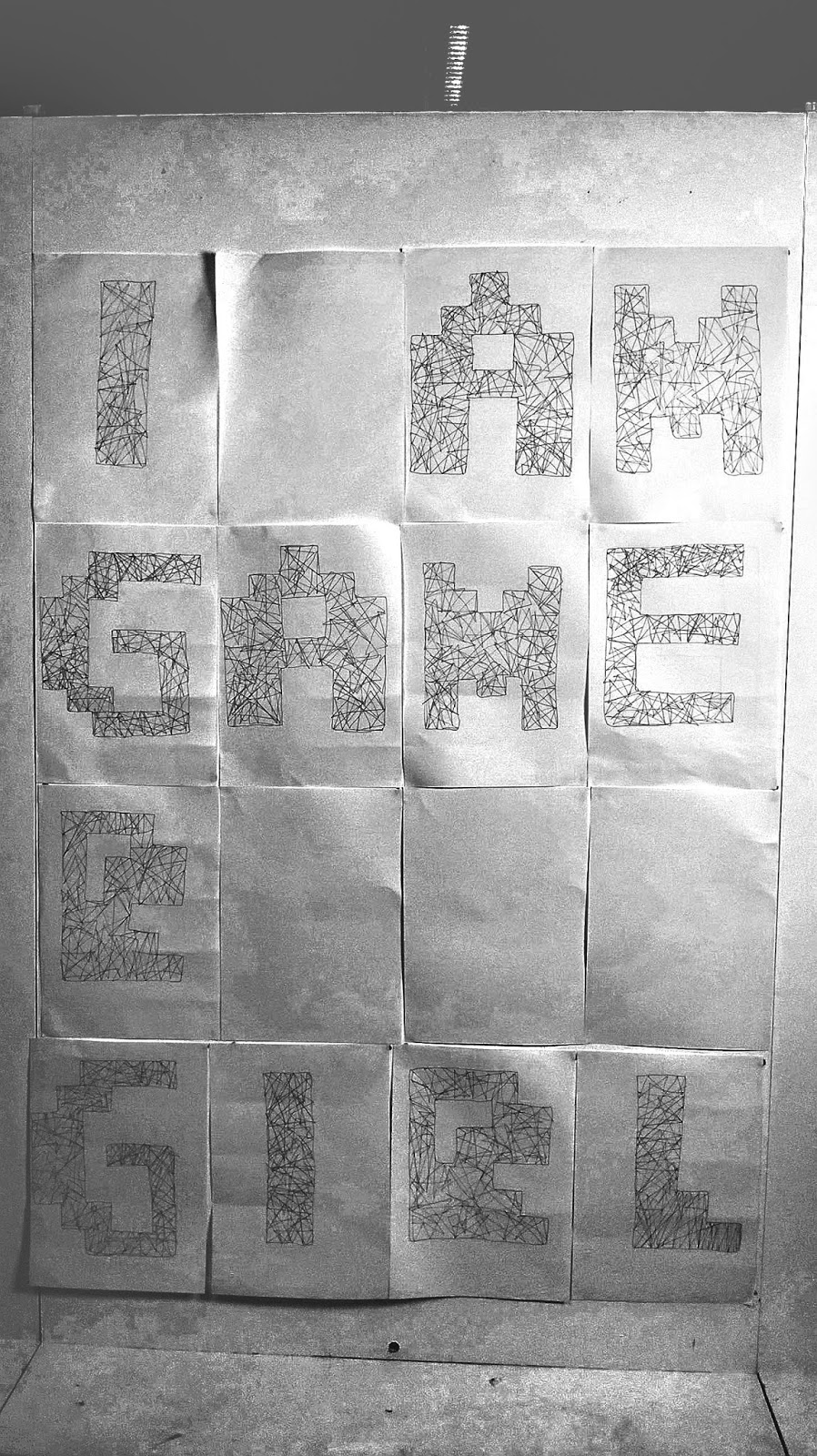
The outcome of my work, it definitely stands out when it is looked at from a distance because the inside shapes appear to be close up together with no empty spaces inside of them. The fact that the 'r' from gamer does not fit in the word grids does not matter to me because it is still giving the right message of who I am.
Our next physical studio session we was continuing with our typeface from last session but this time we were given the task to blow up it out, making it larger on A3 paper. We were given paint from red and black, thick threaded strings, tissue paper, clean steel wire ball and plastic tape for materials we can incorporate in our work. The style and material our blown up typeface can be completely different from the our previous typeface. Initially I used black plaint for one for an experimentation, scrubbed in paint on white A2 paper with a clean steel wire ball as this will quicken the process and give a roughen effect in each letter. Usually when people think about gamer girls they assume they are opposite of classic. I thought it would be good to imitate this. However my outcome was not in particular style I was heading for. There was two finger print and smudges I found in some of my work, I realised from that point on that it may not be effective way of creating a typeface.
I decided reassigned on different and new design with a simple style on A3 white paper, this style did not consist of many mistakes as my other one. I decided to just use black light pen for outline my letters and design lines which match a triangle shape inside each letter but at the same time I did some scribbles in sections that were empty with white space. I did not use a ruler because I wanted it to seem as if it was hand drawn with no tools, I found it appealing how I drew some shapes to show out of the outline and so I continued with this type of design for my other letters.
Wednesday, 28 October 2015
Analogue Communiqué Lesson 1 & 2
Physical Studio: Session 1 & 2
This session is Analogue communique and we was tasked to create an original creative typeface that starts with "I am" and the next words you chose had to represent something about yourself. However there was catch, the typeface is to be created in a constricted measurement form of 4x4 boxes on an A4 paper and it also has a character count up to 16. I experimented with different type and tagline because I wanted to see which one was appealing out of all of them.
After sketching out my drafts, I continued to draw the type in the grids we was expected to use. Initially my tag lines were missing "I am" because I felt like that constricted me too much, these two were the two designs that caught my attention. I have no patience sometimes and I am a gamer girl, I love to play or watch game plays in my own free time. "No Patience" typeface style was thought of by myself whilst "Gamer Girl at (heart)" was inspired obviously the type you would see in a gameboy. I chose to go with "Gamer Girl at (heart)" because I loved the boldness and the corners of the letters.
I began to design each letter on an white A4 paper which represents the grid. The letters were difficult to design on a bigger paper because I needed the right measurement for to the create the accurate boldness which would fit the paper too. I designed two different "G's" as you can see above as I was it impossible to have the same image as i did on my draft sketches, It would take a long process to draw each close up line for each letter and so that is why I had also designed the one of the right. It was simple comparing to the left "G" but it was still interesting to me.
2nd Analogue Communique outcome
This is my typeface outcome, I replaced the "at (heart)" because I needed less letters to fit in the "I am", although initially I was not going to do it, I decided that it is best to follow task we were presented. Although I am happy with my outcome, I wanted to further develop my design using a scanner technique I have always wanted to try out because I like the distorted effect you could get when you move the paper you are trying to scan it. This is the result of quickly moving the paper without closing the scanner, I received the effect I wanted with a bit of surprising orange,red and blue colours around the letters. If i had to choose the one I really like then it would be the scan technique. I enjoyed this session and I found it engaging.
Subscribe to:
Posts (Atom)