
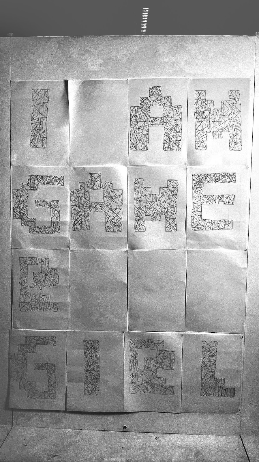
Our next physical studio session we was continuing with our typeface from last session but this time we were given the task to blow up it out, making it larger on A3 paper. We were given paint from red and black, thick threaded strings, tissue paper, clean steel wire ball and plastic tape for materials we can incorporate in our work. The style and material our blown up typeface can be completely different from the our previous typeface. Initially I used black plaint for one for an experimentation, scrubbed in paint on white A2 paper with a clean steel wire ball as this will quicken the process and give a roughen effect in each letter. Usually when people think about gamer girls they assume they are opposite of classic. I thought it would be good to imitate this. However my outcome was not in particular style I was heading for. There was two finger print and smudges I found in some of my work, I realised from that point on that it may not be effective way of creating a typeface.

I decided reassigned on different and new design with a simple style on A3 white paper, this style did not consist of many mistakes as my other one. I decided to just use black light pen for outline my letters and design lines which match a triangle shape inside each letter but at the same time I did some scribbles in sections that were empty with white space. I did not use a ruler because I wanted it to seem as if it was hand drawn with no tools, I found it appealing how I drew some shapes to show out of the outline and so I continued with this type of design for my other letters.


No comments:
Post a Comment