Saturday 30 April 2016

Competition Brief: Tweeking with YCN final outcomes


YCN Final outcomes
These are my YCN final outcome for the Fever-Tree malaria competition brief. I designed each one one on Illustrator. The aim of the brief was the design a new Fever-Tree cover relating to malaria but influenced by 4 countries in one continent. I chose Africa and these designs art work were inspired by Angola and Ghana. Angola is famous for their tribes and Ghana for their fabric patterns. These two designs were my favourites out of 4.

On Jay's workshop for Cinema 4D, we learned how to make prototypes like bottles and cans and how to add on the essential like the label art work. One of my favourite things about this lesson was how quick something that looked digitally made looked like a photograph of a real bottle in the end. It was the texture of the colour we used, I got to learn about reflection legacy. It sparked my interest immediately when I pressed render to see what it looked like. Since I had already designed a package label for Fever-Tree, I thought why not try them out.

New Tweeked Final Outcomes on C4D


These are the outcome of work, from illustrator to C4D, I love the real look to it and I even got to fool some people with them. I followed the same steps from Jay's lesson, I only changed a bit of the lightening and the colours for the bottle and bottle cap. I first used Illustrator to probably layout my cover labels for the bottle, trying to make them possibly the same way as Jay's art work. Then imported the art work from C4D on the colour section from the cynlinder layer which was used for a object for the artwork to be properly placed on.

Screen Shots of Process


Thursday 28 April 2016

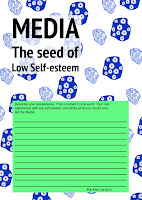
Autonomous Reassurance Letter Cards (I designed for the purpose to uplift women from Low selfesteem)


This something I decided to work on after being inspired by Ellen Gallagher who is an American Artist. Her work 'Wiglette' inspired me to work on this piece because her practice is concerned with a desire to reclaim the image of black histories and black people's confidence as a whole. The whole subject matter is something that I can relate to because It is something I am going through right now which is low confidence in looks. I know many other black females that have been through it their lives and some that are already 40's are still going through it. For example black persons hair is very curly, so curly that you will not be able to tell until you get up close. I just recently started to accept my hair texture, i stopped putting in relaxer in my hair which is chemical to straighten your hair for 4 months (Not healthy for your hair, it can even cause cancer) but this is what many Black women use because of the strong influence western media. You keep seeing women of different colour on the T.V and as a kid you assume that it is a specific look that is only beautiful.

I know that the media is major play in beauty standards and many women are heavenly effect by this to the point of getting surgeries. I want women to know that you are not ugly just because you do not see your looks on the media, the media is always going to strive for a certain look even if half of the people in charge of media have the opposite features to what they advertise.  The purpose of these cards is to bring women together, those who have went through low self-esteem and found something that helped them overcome it because this is exactly what could help other women that are still experiencing it. The women who been overcoming will write in a card that they will need to stick on the wall for others to see because someone who has low-self esteem may read other peoples experiences and maybe look into it.  


Experiments


I want the women to know what the media's role is in their life. It is not their to help us, it is there to advertise their way of doing things especially when it comes to look. So that is why the title for cards is "Media, the seed of low Self-esteem".  I used a pattern I personally made last year because I took an interest in pattern designs. I think the pattern fits very well, it shows a girl theme, but looking closely to these nothing effectively stands out for me except the last image so I wanted to improve the look of it.

Development


I found this more effecting in grabbing attention especially from women. It is an eye grabber for my target audience. The type was influence by Japans traditional ways of laying out text. The title went from "Media, the seed of low Self-esteem" to "Autonomous Reassurance Letter",  I figured this explains to more about the card instead propaganda approach. I love the layout and design of my card and wish to see what they would look like printed out in different materials. I went back to the original pattern design and found that it blended in better. 


Wednesday 27 April 2016

Visual Appendix Final Piece: Manga Novel: What are female roles in mangas and why are they portrayed that way?


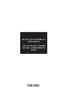
My Visual Appendix Final piece. A short informal manga relating to my essay question. I really enjoyed designing this manga, I honestly hope to make more in the future.

Thursday 21 April 2016

Lecture: Wiglette by Ellen Gallaghar


In todays lecture with we learned about Ellen Gallagher who is an American artist that has done numerous work that were targeted at African Americans about the black minstrels, science fiction and advertisements. She has Irish and African American Origins which was what shaped her subject matter of her work. Her work has a lot of repetition and revision of minimalist geometry shapes structures in her work. 


Wiglette from DeLuxe,2004 Photogravure, and plasticine

One of her most famous work is called Wiglette from Deluxe created in 2004. She collected images from old magazines that were aiming at African American women hair styles. Many people suggested that these hairstyles were the use of prosthetic enhancements to diminish blackness. In other words it was to influence black women to have more of European American hairstyles rather than then their own which was tight curly texture hair. So Gallagher appropriated images from the magazines with a range of materials such as plasticine, rubber, and coconut oil. 

I researched Ellen Gallaghar's work because her practice is concerned with a desire to recliam, renew and reimage black histories in the African diaspora. The whole subject matter is something that I can relate to and many African American who are concerned with their features and history. Her work is very inspiration and makes me want to approach this subject matter but in a way to heal us.  

Wednesday 20 April 2016

The Real Anatomy of Technology


The Real Anatomy of Technology

Mads Peitersen is a multimedia, Danish artists, who illustrated series of combination relating to anatomical biology with technology. This illustration featured popular electronics that we see in our new generation; Play Station, X-box, IPhone, game controller, camera and more. The illustration are of dissected technology revealing what we can see are human body parts such as the bones and livers etc. Now that may a very different and crazy look but if we went into depth into thinking what it could be depicting, then I would say this could be the real anatomy of today’s most popular used technology. I say this because I think it is showing how humanity could not live without it and we are getting deeply attached that it could even be seen as addictive. The idea is that these gadgets are becoming so advanced and cool today that we almost treat them as if they were alive. In a way users become attached to them. I believe that after you have had your iPhone or your Xbox 360 for a while you slowly begin to see yourself as connected to these brands or gadgets. They almost become an extension of yourself or your hands. It is the feeling that we connect and attach to these machines individually. The metaphor is that a really rather simple and very dead gadget gives people a feeling of being more present, more alive. And they relate in larger degree with these gadgets almost on a par with a pet or a friend. We have started to see these technologies as one of us. His illustration makes the viewer’s question today’s society and what we do in our spare time. I think that Peitersen work is very clever and creative, in the beginning you are attracted by the colours and also at the bizarre combination but when you take the into trying to figure out why Peitersen did this, it could lead you into thinking.   


Wednesday 13 April 2016

Selfie Graphic & Narcissism infographic: Info-graphic Video inspired from After Effect workshop


This is one of my final piece work that I had design in response the my idea which was Selfie graphic and Narcissism for the Conversation Brief but it was also a response to Motion city workshop. In the beginning I had just designed a long big info-graphic poster with Selfie facts following Narcissism facts and the reasons why it they both can relate. It was made to question if Selfie was contributing to narcissism. I was happy with my final piece but then in the following week, I had a After effect workshop which taught us how to use a bit of the camera. This workshop was called 'Motion City'. I really loved what the camera could do to your animation work and wanted to try some more of it myself. That is when I decided to make an info-graphic animation of my poster. I used many of the same illustrations I already produced on Illustrator for my poster but also made new ones. I used the camera zoom on the part where the instagrams likes comes in and rotates around. I thought it was a cooler opening for the second composition rather than it just being someone already using the phone. The link below is the full final pieces for the conversation brief. 

https://www.behance.net/gallery/36658153/Selfie-Graphic-Narcissism

Friday 8 April 2016

Improving England's Weather Infographic: Audio and wind.


I really enjoyed making my info-graphic for After effect workshop and that made me want to work on the animation more as I can go into more depth with the clip and try and improve it. Although I was happy with my outcome, there were things I noticed that I should of done on the video. This was proof read,  more of weather animation and lastly Audio. So these were the three things I focused on for my improved info-graphic video.


I wanted wind in the end to join the rain as I feel like rain just look plain. England's weather is bipolar so that is why I had show sunshine a high degree and at night, rain with a low degree temperature. I needed a solid for the wind effect which is called Fractal Noise. I dragged the Fractal Noise to the solid which made it look as if it was filled with white lines in a black background. After editing the brightness and contrast, I got a closer look to a wind but it still did not move and it looked unrealistic. That is when I played with the Evolution which is the key to animating this effect. I was filled with glee knowing that I had a wind even though it was going just straight and I knew needed to work on that. In order to have the wind more realistic looking, I needed an effect called Brezier Wrap. This caused the plain wind to go all over the place as most winds should do. After I was satisfied with the grammar and the new weather animation, I moved on to the ending of the clip that I knew I needed as I had to credit the Audio to the original artist. I used a smooth modern Jazz music from an upcoming artist. I found my info-graphic video looking ten times better than the original and I am glad I played more with it.